ABOVE went UNDER


I'd go in spite of such a horrible logo (seriously the S looks like an ***) if it got wonderful reviews, but they're already dealing with a bunch of negatives for the public to move beyond. I don't know how anyone could look at that and think it's either elegant or appealing. They'd be better off with straight type in a simple font that didn't look like an old sweet 16 invitation.
mikescott said:
shh said:
That's a horrible, horrible logo.
qrysdonnell said:
New management and name (1 South). May or may not be open already from what I hear.
There is a website, but there's nothing there - http://1south.com/
I have seen worse... but really does anyone go to a restaurant because of a website or logo?

A friend of mine went the other night. He said he was impressed with the food and the service. Prices were higher than he expected.
I could see the logo being important for a national brand but not for a local restaurant. Panera has a lousy logo and does fine. good service and food will be all it takes.

Sponsored Business


Promote your business here - Businesses get highlighted throughout the site and you can add a deal.
For Sale
-
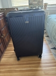
REVO luggage $100
More info


1 South: The Mercedes of restaurants.